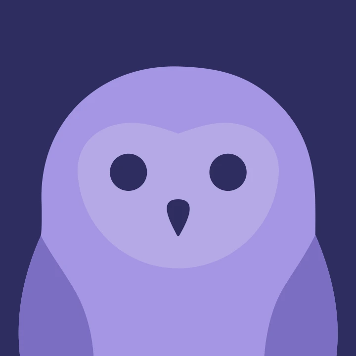
The Owl Got Redrawn
Gryt's logo was a photo of an owl traced in Figma with a face added. It lasted three and a half years. Here's what replaced it, and why the change was bigger than a new drawing.
A G in a diamond, and then an owl
The first Gryt logo wasn't an owl. It's still sitting in
Gryt-chat/deprecated-client where I left it in 2022, and I don't remember
making a case for it.
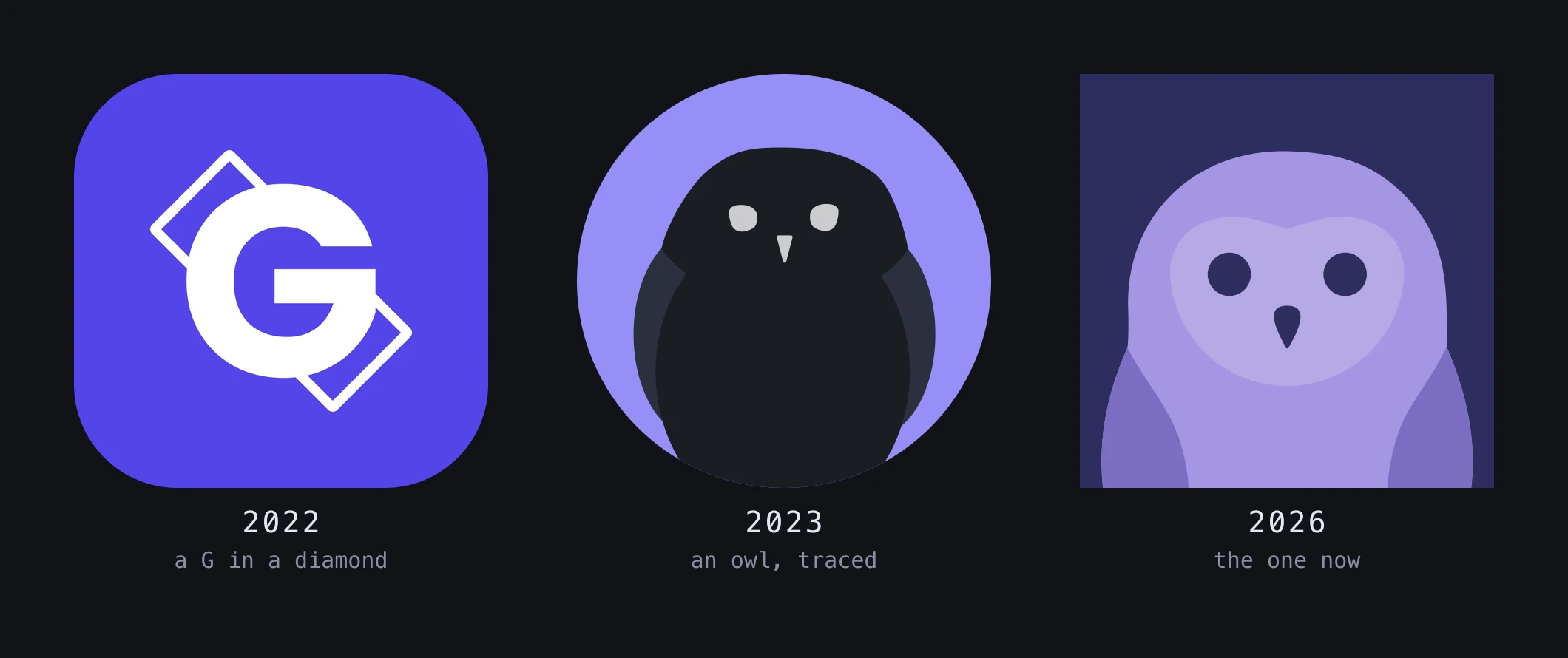
The owl arrived in 2023, and its origin story is the whole of this paragraph: I googled a picture of an owl, traced it in Figma, and put a face on it. Gryt needed something better than a letter for a login page, and tracing a photograph got me a shape in an afternoon. It went on the login screen, then the app icon, then the tray, then every README, and it stayed there for three and a half years.
What I did with it in that time was recolour it. There's a folder in
Gryt-chat/gryt-assets with the bird on violet, on blue, on grey, on salmon, on
a rainbow for June, light on dark and dark on light. Every one of them is the
same traced silhouette with the same two dots for eyes. I wrote about that run
of variants in Designing Gryt's Identity as if
it were design work.

For three years I treated the colour as the thing that needed decisions and the drawing as settled, when the drawing had never been decided at all. It wasn't a bad mark. It was an untouched one.
Why it had to go
A logo spends most of its life small, and that's what finally moved me.
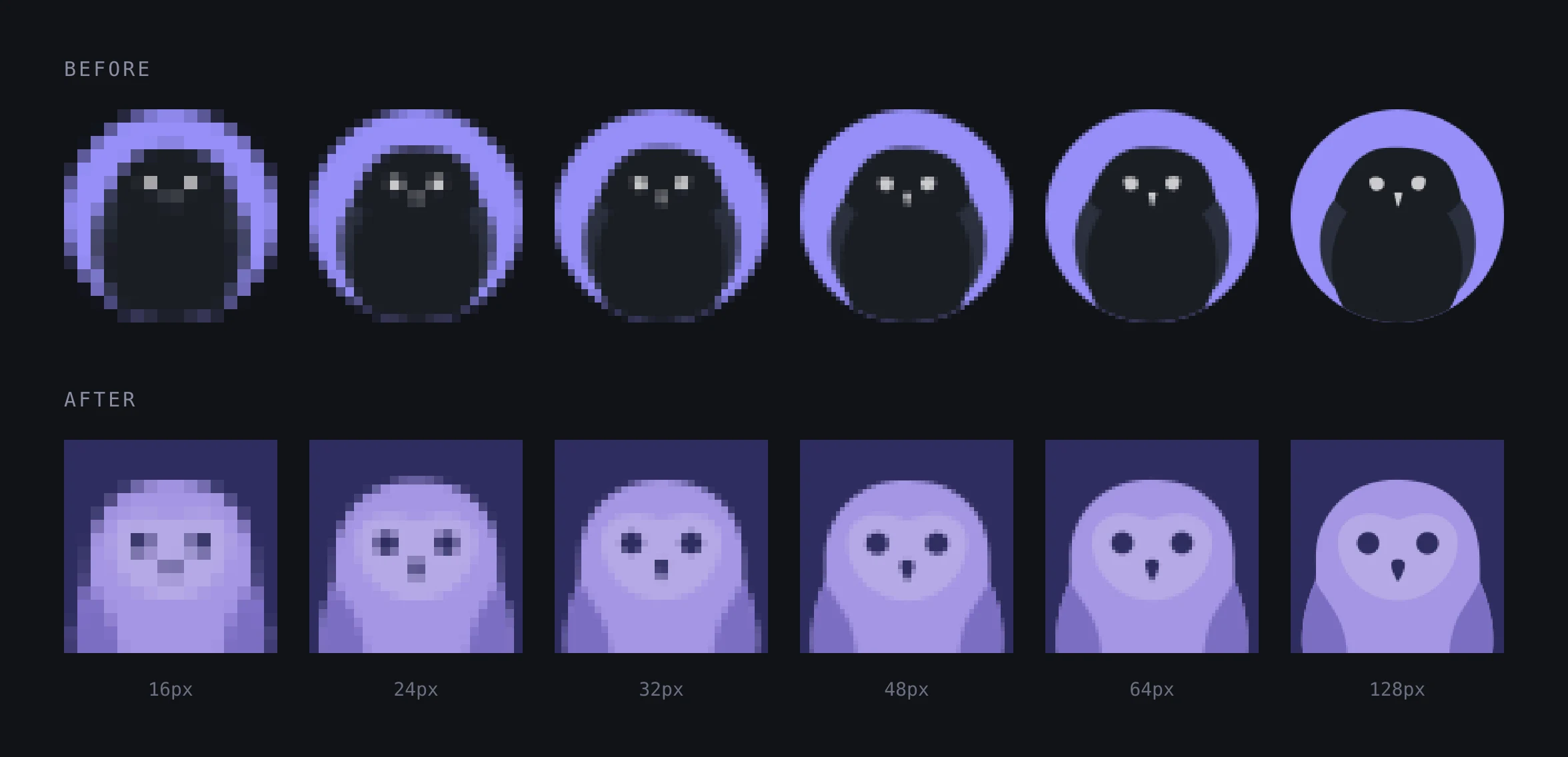
A tray icon is 16 or 22 points. A favicon is 16. A taskbar icon is 24 or 32. At those sizes the old mark loses the thing that made it an owl: the bird is dark on a dark-ish disc, the eyes are two specks, and by 24px it reads as a blob with a rim.
The new one has a face plate — a large light shape holding two dark eyes and a beak — and a face plate survives being small. At 16px it's still obviously a bird looking at you.
Figure and ground also swapped. The old mark was a dark owl on a violet disc. The new one is a violet owl on a dark indigo square. That sounds cosmetic and is the reason most of the engineering below exists.
What a new drawing actually costs
I expected to replace one file. Three other things turned out to have been derived from the old drawing, and none of them survived it.
The tray icon was never the logo scaled down. It's a hand-built shape with
the face cut out, and its coordinates came off the old bird. So they had to be
measured again rather than nudged: render the new mark, read getBBox, and take
the numbers.
left eye   (369.5, 495.5)  r 53.5
right eye  (655.8, 495.6)  r 53.6
beak        x 479.8-545.6, y 573.2-678.9
The first attempt produced a completely blank disc, because the features were still being re-centred on the old drawing's origin and landed outside the circle. That bug is invisible in any editor and obvious the moment you render the output at 16 pixels and look at it, which is now a step in the script.
The beta build's wink stopped working. The client inlines the mark so a beta build can recolour it, and it tinted the background. That worked when the background was the violet. The background is the dark now, so tinting it only made a dark square slightly different dark. The tint moved to the bird, and the wink moved with it, and it had to replace an eye rather than draw over one, because the eyes are painted in the ground's own colour and a stroke on top of them reads as nothing.
macOS wanted a silhouette anyway. A *Template.png is read for its alpha
and painted black, so handing it a full-colour logo gets you a solid disc. The
menu-bar icon is the bird's outline with its face cut out and the eyes and beak
drawn back inside the hole, because the face is the biggest shape in the mark
and cutting it means the silhouette still has an inside at 16 pixels.
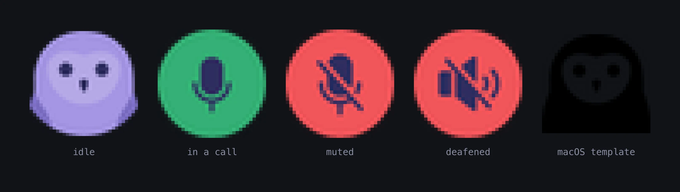
Four other menu-bar styles were built and looked at first, painted black on a light bar and white on a dark one the way macOS actually does it. A head outline had been tried once before and rejected for reading as "a lump with two dents". A stroked outline is the most like everything else in a menu bar, which is also the argument against it.
Shipping the new mark everywhere
Fourteen READMEs across the Gryt repositories show the mark, and every one of
them points at the same raw URL on main. That's either very convenient or a trap,
depending on which file the URL names.
It named the square artboard, so all fourteen showed a square. What they should
show is the round mark. Rounding the file in place wasn't an option, because
the icon generator reads it for the macOS .icns, the Windows .ico and the
Linux icon, and those want the full frame under a launcher's own mask.
So the two files swapped names. logo.svg is the round mark and the public
face; logo-square.svg is the artboard, with one consumer. Every README updated
itself, and nobody had to review fourteen one-line pull requests.
The check that it worked is that regenerating the icons afterwards produced a
byte-identical build/.
Where the mark lives now
The client, the site, the docs favicon and the phone app all carry it.
Two places on this site didn't, for a day. The share cards had the owl inlined twice, once as a small glyph and once as the whole mark, so every card on the site kept the old drawing. And the header logo pointed at the square artboard, which next to a wordmark at 28 to 44 pixels reads as a broken image. Both read the file now, and the recolouring throws if the palette moves rather than quietly drawing something else.
A copy of the bird has drifted from the original here before. The drawing still lives in three places in the client alone, with nothing tying them together at build time.
The new mark is not the
avatar owl. @gryt/owl draws people, the mark is the
brand, and they're separate drawings that happen to have learned the same
shapes. Changing one doesn't change the other, which is deliberate: an avatar
that shifted because the logo changed would be the exact failure the avatar
library is built to avoid.