
The Component Library Behind Gryt
Gryt's interface moved out of the client and into two npm packages that share one set of tokens, so the desktop app and the phone app can look like the same product.
For most of Gryt's life the interface lived in one place: the client. A button
was a <button> with some Tailwind on it, written where it was needed, and if
the next screen needed a button too, that one got written where it was needed.
That works fine until you have a second renderer.
By the summer I had three surfaces that had to look like the same product. The
desktop and web client, the sign-in page that Keycloak serves, and a React Native
app that was about to exist. Three codebases, none of which could import a div
from the others.
So the interface moved out. @gryt/ui is the web half, @gryt/ui-native is the
React Native half, and both read their colours, spacing, radii and type from one
theme object in @gryt/theme. The repository started on 30 June and is
documented at ui.gryt.chat.
What the library contains
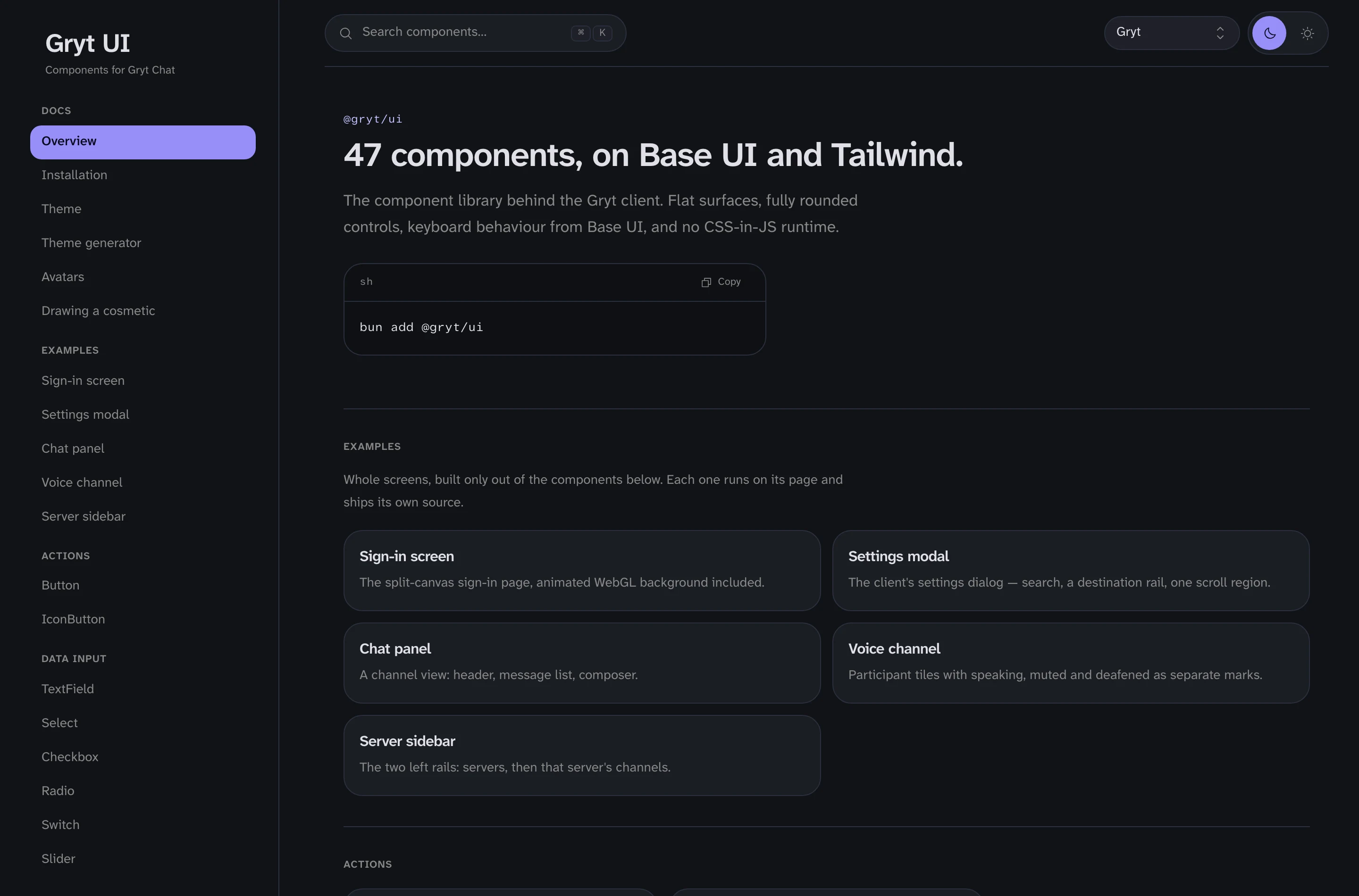
47 components. They're built on Base UI, the MUI team's headless library, so the keyboard behaviour, focus trapping and ARIA wiring come from people who do that for a living, and the styling is Tailwind on the Gryt palette. There's no CSS-in-JS runtime. The stylesheet is compiled and you import it once.
A dialog that traps focus properly, a menu that responds to arrow keys, a combobox that announces itself: those are weeks of work each, and getting them subtly wrong is worse than not having them at all. Base UI ships them unstyled, and I style them.
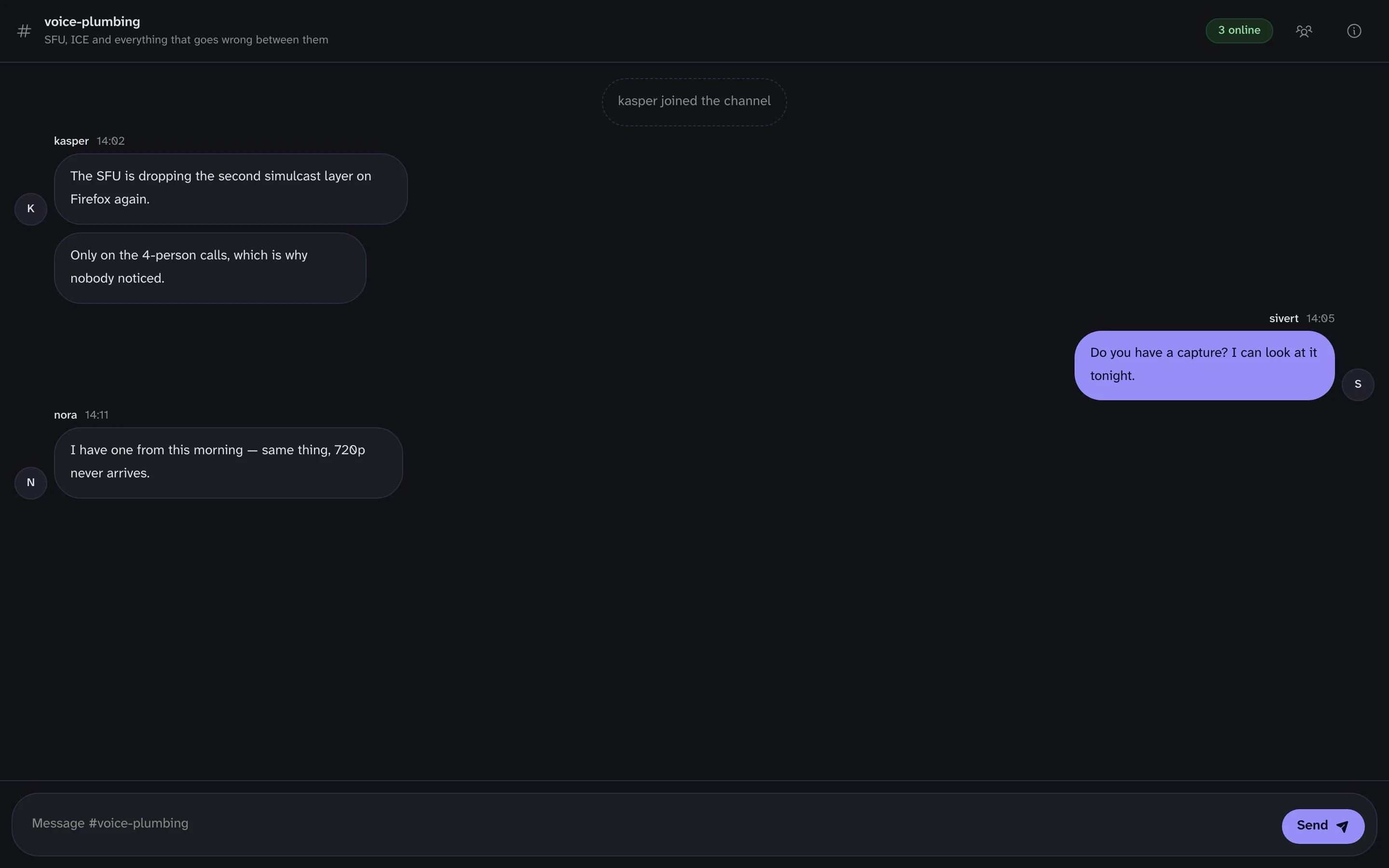
The docs site also carries whole screens built out of nothing but the library: the sign-in page, the settings dialog, a channel view, a voice room, the two left rails. Each runs on its own page and ships its source. They exist because a catalogue of buttons doesn't tell you whether the parts hold together.
The native half reads the same theme
@gryt/ui-native is where most of the work went this month, because React Native
has no CSS and gives you a different set of primitives to fight. Sheets, drawers,
sliders and swipe gestures all got rebuilt on react-native-gesture-handler
after the hand-rolled versions turned out to fight the scroll views inside them.
What the two packages share is the theme. Same token names, same values, same
GrytProvider shape. A colour is --gryt-accent on the web and theme.accent
on the phone, and both come out of the same file. When the theme learned to carry
a font, it learned it once and both renderers picked it up.
Themes are a link now
A Gryt theme is a couple of dozen hex values. That's small enough to be a URL, which changes what a theme is for.
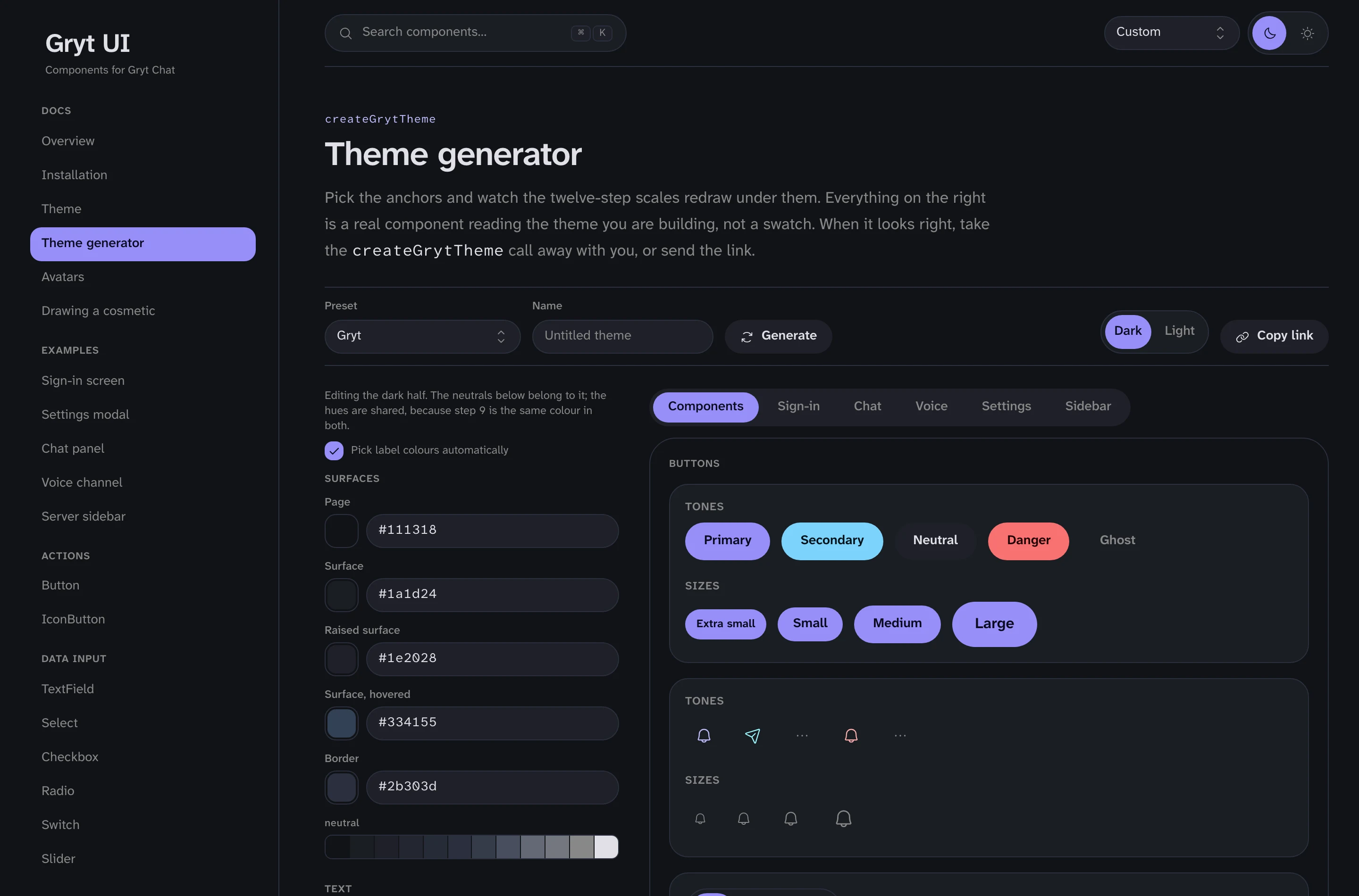
The generator at
ui.gryt.chat/theme/generator puts an
editor on the left and real components on the right, not swatches but the actual
Button and TextField and voice tile reading the theme you're building. When
it looks right you press Copy link, and pasting that link into the client's
appearance settings applies it.
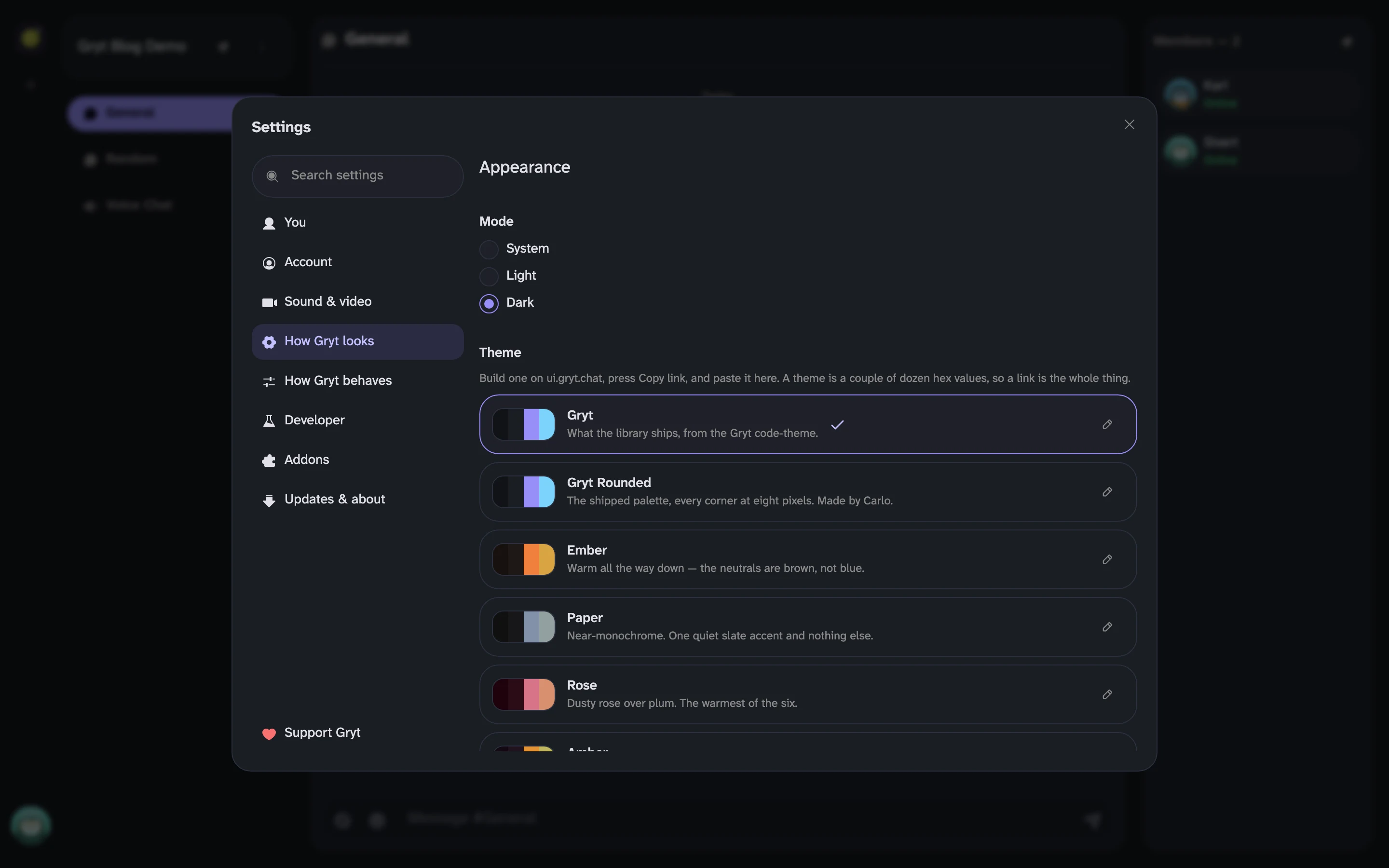
The library ships 18 presets. Six of them are pulled from the owl avatar palettes — Rose, Amber, Wine, Indigo, Forest and Ice — so a server's chrome can match the birds in its member list. Seven are ports of themes people already know: Dracula, Nord, Catppuccin, GitHub, Claude, shadcn/ui and Solarized. Every one is checked for contrast in both light and dark before it ships.
One of them isn't mine. Gryt Rounded is the shipped palette with every corner set to eight pixels, which mostly means the controls that were pills stop being pills. Carlo built it in the generator and sent me the link, I pasted it in, liked it, and it's a preset now. That loop working is the part I wanted from the generator, and I didn't expect it to happen within a week.
Releases stopped being manual
The other thing that changed is boring and has made everything else easier.
@gryt/ui and its siblings are on changesets.
A pull request that changes behaviour carries a small markdown file saying which
packages it touches and whether it's a patch, minor or major. When that merges,
a bot opens a "Version Packages" pull request that collects every pending
changeset, writes the changelogs and bumps the versions. Merging that publishes
to npm.
74 of those have merged so far. @gryt/ui is at 0.21.1, @gryt/ui-native at
0.13.4, @gryt/theme at 0.7.0. The version numbers are only interesting because
before this, "what changed between the version the client uses and the one the
phone uses" was a question I answered by reading commits.
The packages are MIT, unlike the AGPL-3.0 apps that use them. If you want a chat-shaped component library for something that isn't Gryt, take it.
What the library does not do
It isn't a general-purpose design system, and I wouldn't recommend building a dashboard on it. The primitives are chat primitives: message rows, member lists, voice tiles, a sheet that behaves on a phone. There's no data table, no date picker, no chart.
The version numbers also start with a zero for a reason. Props still move. If you depend on it, pin it.
The full catalogue, with every component's props and a copy button on each snippet, is at ui.gryt.chat. The avatars have their own page there, and their own post.